Graphix
Sports Flyers
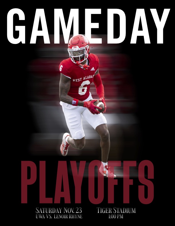
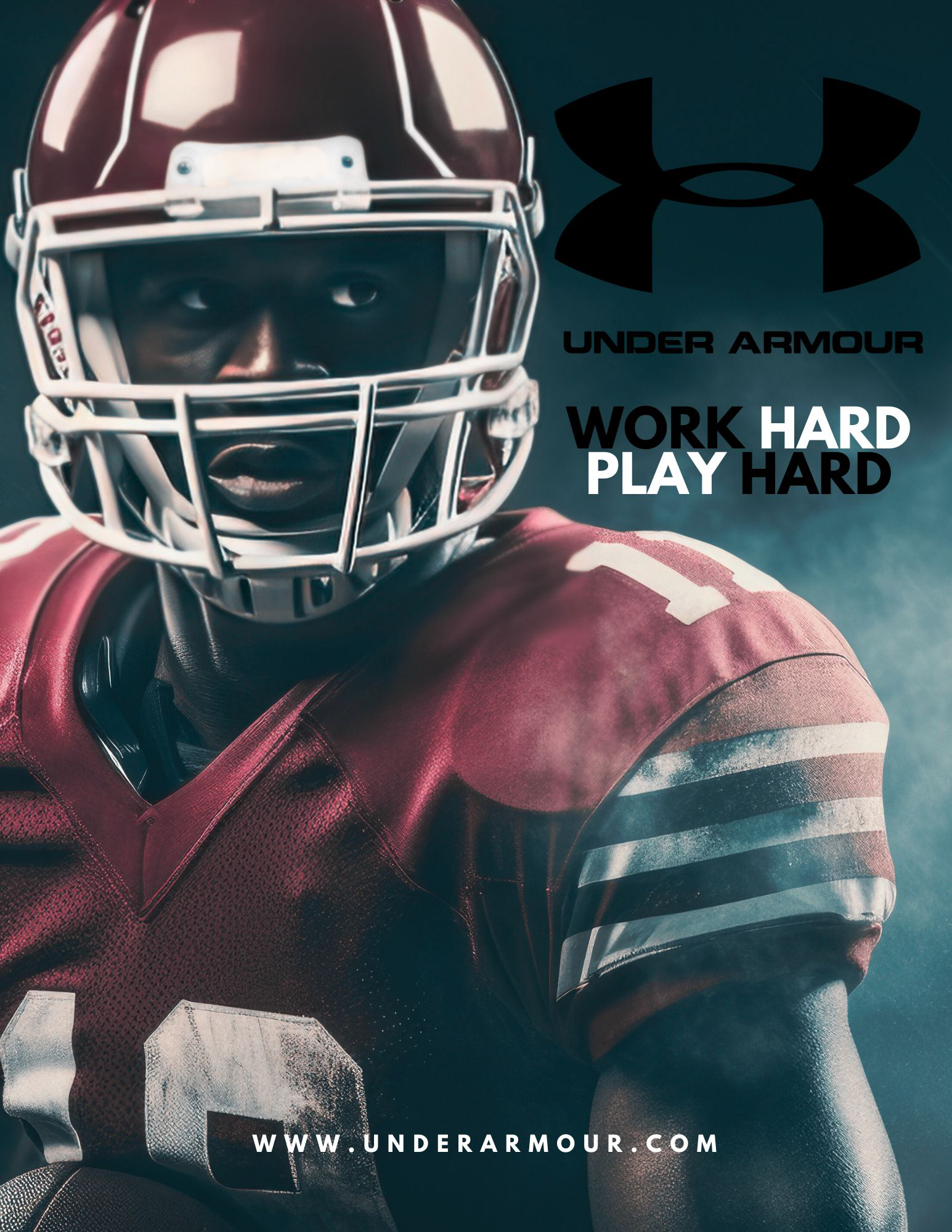
The first flyer you see is a “GameDay” graphic that was designed to catch the eye and promote that the UWA Tigers were going to the playoffs. I used Adobe Illustrator and Photoshop to create the in-motion feel. The flyer to the right is a mock Under Armour advertisement. To achieve this look, I found Free images of football players and the company logo on Vecteezy, edited each item in Photoshop, and created a foggy effect in Illustrator.


Movie Poster Layouts
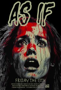
As a challenge for my Graphic class, my colleagues and I had to compete in a fake movie poster competition. We were tasked with making three different genres of movies with the same title we were assigned. My title consisted of “As If”, and I chose to create Sci-Fi, Romance, and Horror genres. Fortunately, I won this competition with my horror film and shocked my peers with a unique retro thriller poster. To create each of these, I used free sites to obtain the images/vectors. I edited their coloring and sizing in Adobe Photoshop and Illustrator. I also downloaded new fonts from dafont.com and Adobe Fonts.
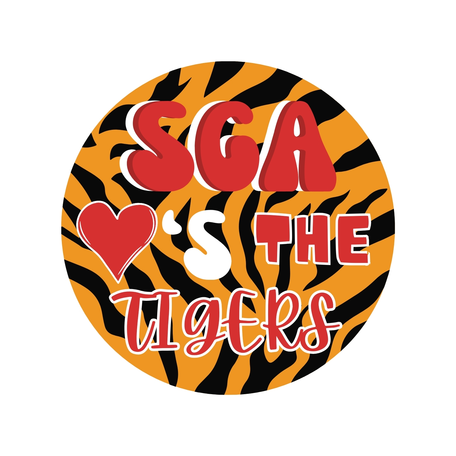
SGA Button Designs
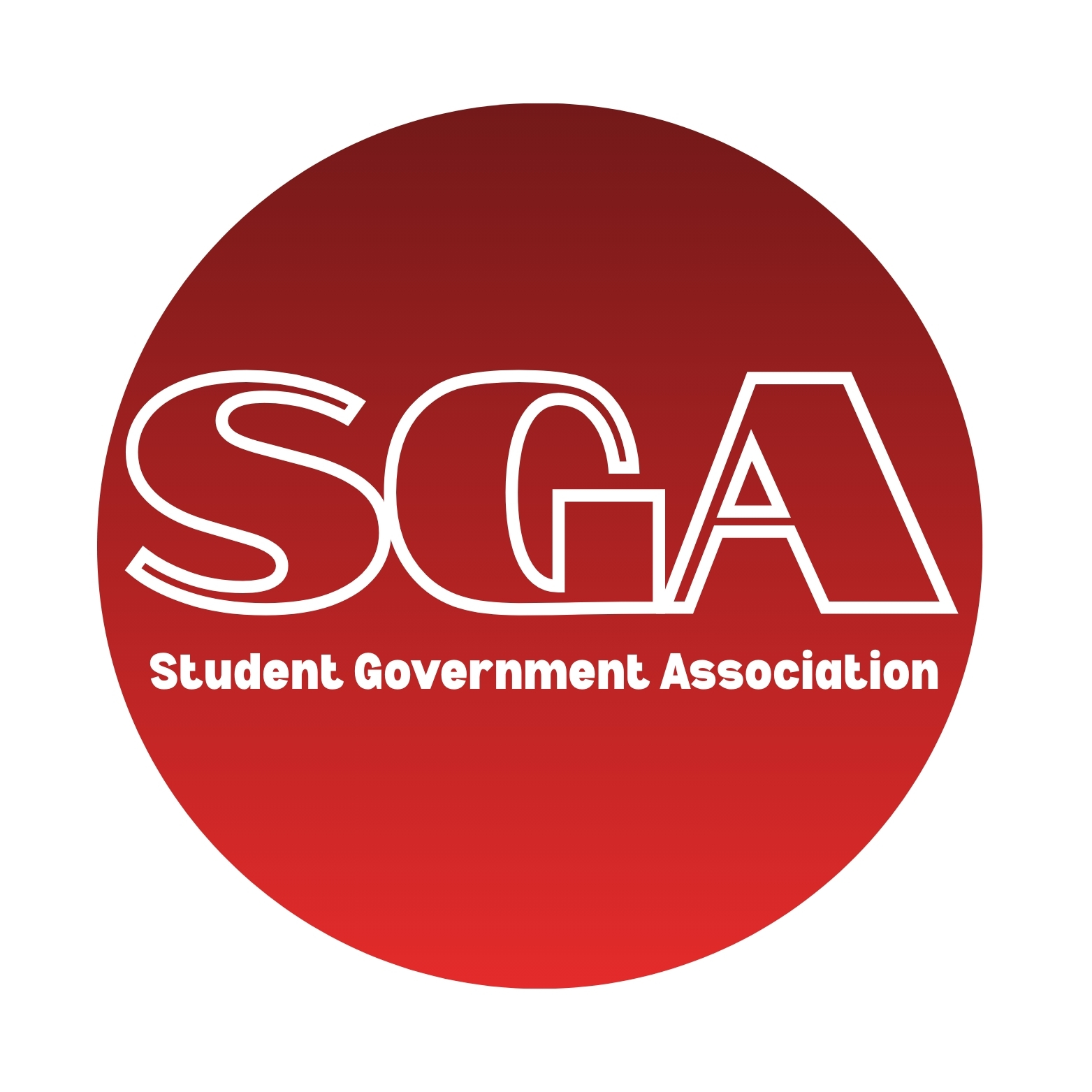
As the university’s SGA graphic designer, I was asked to create custom buttons for the first football game of the season. I used free images and fonts, and created the final draft in Adobe Illustrator. I was inspired by the organization’s colors and the university mascot “LUie the tiger”. The end product was entirely sold out by the 2nd quarter of the game, and the group was very pleased with how they turned out.
